We started with the GOV.UK Design System to get designs into a staging environment quickly, using tried and tested, accessible components and patterns. Using a component library like this helps us test and build designs fast, with online journeys that are consistent and familiar to users.
For BOPS we use the x-govuk components library. It's a layer that sits on top of the GOV.UK design system. It’s easy to reuse functionality where it’s relevant - we can extract reusable components like buttons, tabs and lists. We know that the GOV.UK team have tested these components and built them to high standards for accessibility, so it’s a great base for us to work from.
But GOV.UK tends to focus on ‘front end’ users, or members of the public who might be using a service infrequently. We’re designing for experienced planning officers who use the system every day. They do it almost without thinking and both need and expect very little guidance when it comes to interacting with BOPS.
We needed to adapt certain elements of the design system to meet the needs of these ‘high frequency’ users. This blog is based on an interview with designers and a developer involved in that process.
Making the case for a design system
On a fast paced project, the focus is often on shipping new features as quickly as possible. That can make it hard to convince a client to invest time in improvements when there is still lots to do to ‘complete’ the product.
We’re taking an MVP (minimum viable product) approach to BOPS. This is fundamental to the development of the BOPS Design System, as we know everything is going to be tested and improved - nothing is completely ‘done’. The whole point of MVP is that we’re building a basic version of the product so that we can test, learn and make it better. Making improvements is a fundamental part of this. We’re not building an ‘MVP’ as a final product, rather we’re using a process of MVP to develop a product iteratively. Time spent on improvement now will save money in the future.
When we are building features we’re also testing those components, journeys or patterns. So by building up a design system, we can start testing more quickly than if we were designing every feature from scratch. This helps us learn how to move on from MVP - by capturing learning within a design system, we can iterate on a component or pattern and establish principles that can underpin many features, rather than improving one bit at a time.
From a development perspective, if we keep the code consistent, we get more time to do the hard dev work. On BOPS, we agreed as a team to take a pause and spend a couple of sprints focusing entirely on improvements and building up our design system.
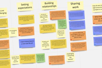
Some of the things that helped us make the case were:
getting product owners and other senior stakeholders to observe testing sessions - there’s nothing like watching someone struggle to complete a task to convince people of the need for change
being open and transparent about our work, sharing progress and learning at demos and Show and Tells
encouraging Product Owners to host demos, so they take ownership of the ‘wow moments’ when we show wider stakeholders how small improvements have transformed the user experience
regular alignment with the client around the roadmap and goals for each phase of work, and recognising that these can change
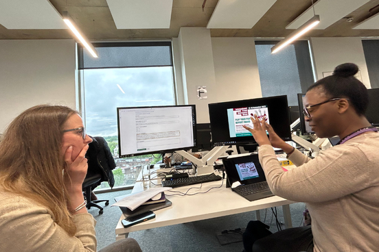
Testing a new component with Barnet Council’s planning team
Why create a bespoke design system?
“How is the problem that I’m trying to solve going to benefit other people?” - Diane Larsen, Tesco
This quote from Diane Larsen’s Converge 24 talk sums up the point of a design system. It’s not about making everything look the same. It’s about finding the best way to meet a user need, then making it easy for other people - designers, developers, marketing teams - to also meet that need and give the user a familiar and consistent experience. The design system is a means of sharing all those insights from research and testing in a practical way. This ultimately leaves our client with a much more useable and adaptable product.
Our designers wanted to give planners the same ‘muscle memory’ they have with their current system. The system should be so familiar and intuitive that they can move quickly and trust it to do what they need it to do. If we start making different patterns in different pages, it will take more time for people to find what they need.
We’ve developed BOPS over several years, so we’ve seen some changes in both the design and development team. We’d also been developing features very quickly so we could learn what worked before we expanded the scope of the work. Extracting common patterns as code helps maintain consistency and makes it easier to share learning with new team members. When we introduce changes to a component, those changes will be reflected instantly across all instances of that component. We don’t have to go back and check every feature.
A design system also makes it easy to expand to mobile - we can map how each component would translate to mobile and test quickly in the field. We’ve built BOPS to be used on desktop, as planners tend to use two or even three monitors to manage their work. But there are use cases for mobile interfaces in different parts of the planning process - on site visits, for example, an officer might want to update records using her phone or a tablet.
Designers and developers working together
But how do you know when to create a new element in the Design System, or stick to a ‘one-off’ pattern that is useful for a specific scenario? This is where good communication between designers, developers and product owners is crucial. Designers might identify a need for a certain pattern, product owners might prioritise another need and developers probably don’t want to recreate code that already exists. So there needs to be a conversation about the most effective way to meet similar needs across the whole journey, rather than everyone working on their own bit in isolation.
It’s not always obvious whether a certain component already exists. More experienced developers will know whether something is already in the x-govuk library or is something we’ve used elsewhere but it can be harder for both developers and designers who are new to the team.
For developers, it’s useful to look at the whole journey holistically, to understand why certain design decisions are being made across the service. That helps developers challenge those decisions and, ultimately, have more productive conversations with designers.
We try to future proof any new components by writing some automated rules in the code which run as part of our continuous integration pipeline. The test would fail if we’re not using the correct component. We’ll also talk to junior developers about how design systems work and how we use them - ideally, this would be part of onboarding. But we need to keep talking about and improving the design system as we’re building. While it should act as a source of truth, a design system is just that - a system, something with working parts and connections, not a static library.
The GOV.UK Design System GitHub is a great resource for both designers and developers. We can see how certain elements have been used or adapted, and read about any new research or testing insights. We’d highly recommend it for anyone who wants to see how design systems evolve.
What do you put in a design system?
Fundamentally a design system should be about finding patterns that enable users to do things as quickly and simply as possible. Components are building blocks that make these patterns work. As Scott Riley said in a recent speech at Converge Brighton:
“Stop f-ing around with components and think about patterns and principles” - Scott Riley, Author, Mindful Design
What is a pattern? It’s usually a series of components that helps a user become familiar with a product or service. It should be based on research and testing to make an experience useable, accessible and intuitive.
Here’s an example from BOPS.
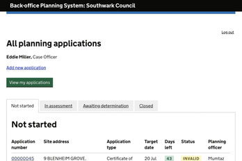
A planning officer makes an assessment of a planning application against a set of criteria, including local and national planning policy. They make a recommendation about whether to allow or refuse the application. They then send their recommendation to be ‘reviewed’ by a manager.
As part of this review, managers will check through the officer’s assessment, partly to make sure everything has been done correctly but also to make sure that the officer’s assessment is fair and considered. Once the manager has reviewed each part of the assessment, they either agree with the assessment or send it back to the officer.
Managers are highly experienced - they might have worked in planning for 15 or 20 years. They can work very quickly. They are also under a lot of pressure, with tight targets and a long list of jobs to be done.
Unlike the assessment process, which follows a sort of ‘step by step’ process that helps officers to work through each task in a logical order, the review process is more like a quick check of a lot of information. Managers need a ‘birds eye view’ of the whole application, seeing everything on the same page and moving through it in a non-linear way. They know how their officers work and know which sections they need to focus on.
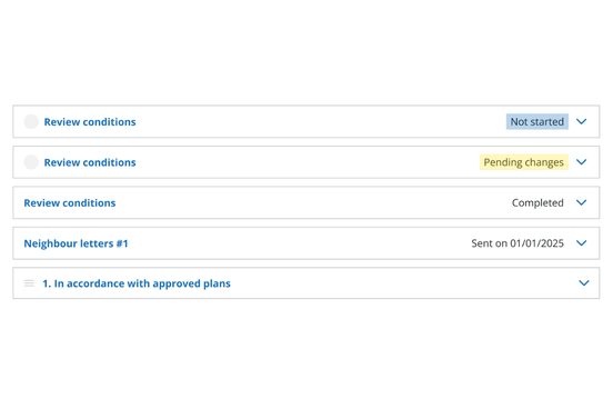
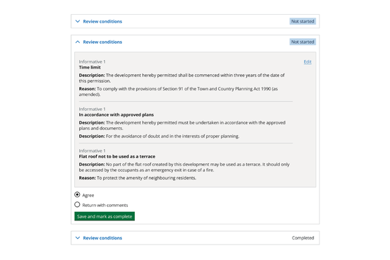
We worked with managers to design a new pattern to ‘review information and mark a decision.’ This helps them to jump between sections on the same page and check off tasks quickly. We brought all the relevant content and documentation into one place so managers can expand for more information if and when they need it. Once they’ve reviewed each section, they can ‘agree’ or ‘return to officer’.
The pattern is made up of a series of components. These include:
an accordion
an edit button
a text table
radio buttons with expandable comment box
buttons
It’s what our designers call ‘very MVP’ as we know there are lots of ways to improve. Using GOV.UK elements like the radio buttons means we can get the pattern out to testing quickly, even though we know the design isn’t quite right (yet).
One example is the accordion. Recently, GOV.UK updated their accordion component to make it more accessible. They had good reasons for this and it made sense for their users. However, planning officers found the new component confusing and not suited to their way of working. It took up more space and made it harder to find what they needed. So we adapted the component, taking elements from the old and new versions while retaining the accessibility elements.
Accounting for variation
The accordion component includes a load of variables that can be toggled on and off depending on the context:
an icon, which could be used to show a user avatar, a brand or a task icon, or just be turned off.
a header, which we’ve made task oriented
a status tag, which could also be a date or some other means of auditing or monitoring the task
a chevron (the little arrow which shows whether the accordion is open or closed)
The image below shows some sketches of how those variants might look:
We can test these variants with users to work out how they can best support the overall pattern.
This kind of variation can make components harder to maintain. If we want it to be reusable, we need to configure the component to be dynamic so it can take different levels of input but still appear consistently to the user. We want to keep all the information in the container quite similar and reduce variation as much as possible. For example, if you have a button with colour variants, it’s unlikely to cause any issues. But when you start adding in conditional logic there is a higher risk of things going wrong when you make an update. These things should all be covered by a test written for that specific component.
Working in sprints is useful for this - we’re implementing new features or improvements all the time, but we review every 2 weeks and are continuously discussing changes amongst the team. The BOPS Design System is based on this positive feedback loop between designers, developers and Product Owners, informed by regular testing with users.
Top tips for creating a design system
Work together. A design system shouldn’t be owned by designers or developers. It needs to come from collaboration between the whole team. it’s a good idea to get a shared idea of what the design system is for before you start - don’t assume that people understand it.
Keep it live. It’s not a static library, rather a guide that you can update and change as you learn more. And because you have reusable components, whenever you update it, it’s easy for developers to make changes across your whole product.
Think about patterns and behaviour, not how things look. The essence of a design system is a set of common patterns that make it easy for users to do what they need to do, almost without thinking. Branding helps, but if you don’t get the experience right, no amount of consistent colours and fonts will save you.
Design systems are not about making rigid or set rules. They’re about capturing what you’ve learnt in a useful way, so you can save time and keep improving. It's still possible to deliver a highly customisable effective experience without reinventing the wheel every time you design a new feature.