Designing and testing for product and service accessibility
Lawrence Richards | Aug 2019
One of our core values at Unboxed is making the products and services that we’re creating simple and intuitive for everyone to access and use.
From visiting places, including the GDS Empathy Lab, and testing with accessibility users, this post details a selection of tools that our teams have found useful and some of the findings that we’ve found from recent accessibility testing.
The gold standard is the Web Content Accessibility Guidelines (WCAG) — a great place to start to begin making every aspect of your product and service as accessible as possible, aiming for AA rating.
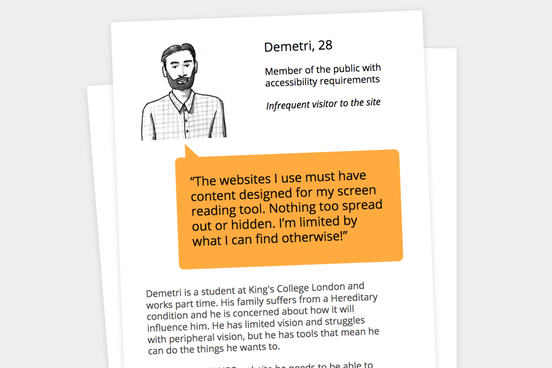
Personas with accessibility needs can be useful to ensure care is taken at every stage.
Avoid vague wording, jargon or technical language, if it's necessary include an explanation or link to a glossary. Introduce acronyms by spelling them out the first time they are used especially if they are used a lot.
When using links in blocks of text, it’s a good idea to make it clear what the link is for. For example, instead of list of dates, the link could be view a list of all the dates for consultations this year. This provides additional context for what will be on the next page.
Design and UX
From a design perspective, the layout of the page should work with those that might have limited eyesight, or use screen magnifier tools. Care must be taken to ensure good contrast, try testing your prototypes using a contrast checker to quickly spot the parts that aren’t showing up well (these might also be an issue in glare conditions). Being able to delineate between different statuses without relying on colours is important, we use sim daltonism to make sure a design isn’t dependant on colour alone.
Order and flow are important in visual design and it becomes even more important if you happen to use a tool to interpret a page. Magnifiers, for example, will limit a users' view, so test to make sure there isn’t too far of a gap between related elements (for example, between table columns).
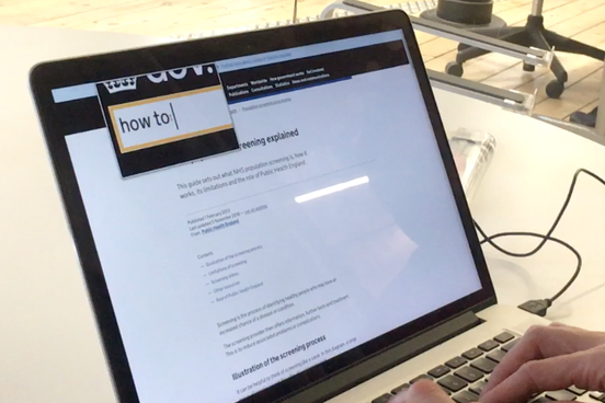
Using the magnifier tool at different zoom levels to spot problems in the visual design.
Coding
How a web page is coded becomes even more important when a user is unable to see a website, and must rely on how a screen reader interprets it. To recreate the effect of a sentence or paragraph; or show section titles; or display emphasis, content must be marked up how it is meant to be read.
A good way of thinking about this is to understand how you would describe the page verbally, if you couldn’t use a visual example. By doing this, you realise you need something for images (alt image descriptions); you need to be able to interpret table elements (correct use of table header and row tags) and you need paragraphs to be read naturally (paragraph tags and avoiding line break tags).
To make it easier for screen readers to get a page overview, using the same tag (for example, h2) allows a user to tab through the sections quickly. It’s like building in a contents page to find content they are looking for without having to read through everything. This might mean assigning sections to parts where there are no visuals elements, for example in this analysis of the gov.uk home page.
Try ditching the mouse and using just the keyboard to navigate through an end to end journey a user of your service might take.
Key insights from testing
To get an idea of the things picked up from testing, here are some insights from a recent round of testing with accessibility users with Public Health England for the UK National Screening Committee:
#1: Spacing of elements
Because of the narrow field of view of magnifying tools, we found that some of our elements had too much space between them, and weren't explicitly connected. Items on rows can be a problem, that you can alleviate by shading the rows, or aiming to bring elements closer together. We found that checkboxes lost their meaning when they were too far away from the element they were inferring was complete.
One way of mitigating this is to design pages that behave in the same way. If content is consistently left aligned then a user will be able to find information intuitively. If at some point elements are aligned to the right, then this will be an issue.
#2: Hover states
Using hover states is risky with magnifying tools. The tools work by magnifying wherever the cursor is pointed. If the content produced from rolling over an element is outside the field of view of the magnifying tool then it is impossible to see and the content is essentially hidden from view. Avoiding using hover states or hidden content is best practice.
#3: PDFs
There are a lot of good reasons to move away from PDFs to HTML pages. But for this project there was a business need for some larger documents to be kept as PDFs. We investigated how to make these as accessible as possible whilst moving as much as we could to HTML. Luckily, there are ways to make your PDFs better for screen readers, such as marking up original documents with screen reader friendly formatting. When exporting, always use PDF/A which prevents further editing and means the document is suitable for longer-term archiving.
A recent user testing session conducted for the National Screening Committee alpha phase.
Every digital item — laptop, tablet, phone — will have accessibility software. A great place to start is by exploring how these work, then using them to test your products and services. Try using inbuilt tools like the magnifier, and going through a service from end-to-end.
The GDS empathy lab is also a great way to get up to speed on the current software and hardware tools that are in use.
But, of course, the best way to understand more about accessibility is to test your service with accessibility users and get their feedback first hand.